YEAR
2024
ROLE
Design Lead
STATUS
Complete
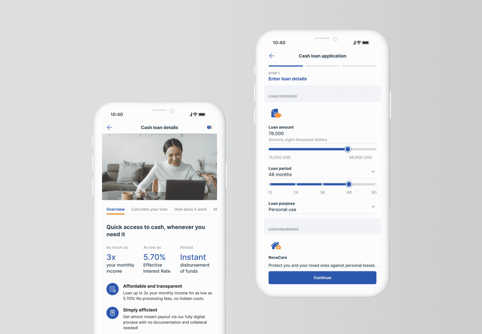
Final cash loan app screens presented on a cover visual
01 / OVERVIEW

A quick-win digitalisation with bank-wide stakes

Personal loans in the mass retail market presented a large revenue potential and were identified as the next quick-win opportunity for digitalisation in a state-owned Southeast Asian bank.

A superior app-initiated cash loan MVP journey was designed and launched for existing retail customers, re-using existing components and journeys as much as possible to shorten time to launch without compromising the quality of the experience. Along the way, the team helped drive design thinking and agile methodologies among the client's business teams.

indicative TOI uplift in the first year of launch
10.6%
indicative TOI uplift in the first year of launch
key cash loan opportunities identified in the kick-start workshop
50+
key cash loan opportunities identified in the kick-start workshop
excellence in optimising the client's ways of working
Sustained
excellence in optimising the client's ways of working
02 / CONTEXT

A loan you could only apply for on paper

Traditional leading banks in the country still operated largely offline. The client wanted to leverage its momentum in digitalising the customer journey to lead the digital space, competing with incumbent and digital banks while providing a customer-centric experience.

Cash loans were identified as a product with large revenue potential in need of a digital uplift. There was barely any information on the website and app to generate product awareness, and applying meant paper forms — an offline process facilitated by relationship managers. The task: digitalise the cash loan application journey end to end.

HOW MIGHT WE

Rapidly design a seamless digital cash loan application journey to boost customer engagement and retention — in 2 weeks?
03 / THE SOLUTION

An efficient, streamlined loan experience

the landing page became the single front door for everything loans

RECORDINGS OF THE FINAL, SANITISED DESIGN

04 / DESIGN APPROACH

A seamless journey, crafted in two weeks

With the client's tight timeline, a compressed and highly collaborative approach was taken to gain insights quickly and move forward effectively. Each step below opens into the full story — what happened, and what changed because of it.

01. Ideation workshop

To kick off the design journey, we orchestrated a dynamic workshop with over 30 participants from various client business functions. This collaborative session was designed to ignite creativity and cultivate the design thinking skillset, whilst allowing us to gather key requirements to drive the project forward.

Design thinking introduction

We began by immersing participants in the principles of design thinking, setting the stage for innovative problem-solving. This foundational overview aligned everyone with a user-centred approach and prepared us for the collaborative work ahead.

Slide introducing the Human-Centered Design process
Crash course on the Human-Centered Design process

Global competitor showcase

To inspire and inform the design process, we presented a range of global competitor cash loan journeys. These examples provided valuable insights into industry trends and best practices, sparking discussions on what could be adapted and improved upon.

Competitor benchmarking mapped along the loan journey
Sample competitor benchmarking along the journey

Collaborative discovery

We explored the end-to-end cash loan journey, identifying customer pain points, opportunities and key challenges. After generating a list of key opportunities, participants voted on the most impactful areas to prioritise which opportunities to address first.

Participants discussing pain points and opportunities
Participants voting on the most impactful opportunities
Discussing pain points, then voting on the most impactful opportunities

Co-creation and prioritisation

With the top opportunities identified, participants engaged in a co-creation session to brainstorm and develop potential solutions. Following the exercise, we collectively prioritised these solutions, focusing on the most impactful features for the MVP and developing a feature backlog.

Participants sketching solution ideas
Participants sketching ideas

OUTCOME

The workshop set a collaborative and enthusiastic tone for the project, aligning diverse perspectives and establishing a shared vision for a customer-centric cash loan journey.

02. Initial design and internal testing

In just 2 days, we designed the first full version of the digital loan journey. By collaborating closely with client designers and utilising existing assets, we created a streamlined and effective initial version.

This was promptly tested with internal bank users — for example branch managers, who had a good view of what their customers were looking for. Rapid prototyping and testing let us gather crucial insights and refine the design.

Testing initial designs with bank staff at a table
Bank staff testing the initial designs
Testing of initial designs with bank staff

Streamlining the overview

We simplified the presentation of key loan highlights to give users an immediate, clear understanding of the loan, and made the language more concise to deliver information more efficiently.

BEFORE

Loan overview before: dense presentation of loan details

AFTER

Loan overview after: simplified key highlights

Enhancing calculator accessibility

The loan calculator moved onto the main page, eliminating the need to navigate away for calculations. We also redesigned the loan summary to emphasise critical aspects such as loan insurance and potential savings, shifting detailed repayment information to a secondary page.

BEFORE

Before: loan calculator on a separate page

AFTER

After: calculator on the main page with a redesigned summary

Greater transparency in repayment schedules

We expanded the loan repayment information, offering greater transparency on repayment schedules and helping users easily understand their financial commitments.

BEFORE

Before: limited repayment information

AFTER

After: expanded repayment schedule
After: repayment breakdown detail

03. External testing and finalising design

With the initial design refined, we turned to external testing with real loan customers. This phase was crucial for validating earlier edits and gathering fresh insights. While proxy users provided valuable feedback, testing with actual end users proved essential for achieving the most optimal, frictionless experience.

Usability testing session with retail customers
Usability testing with retail customers

Enhanced visual distinction

We introduced clear visual cues to differentiate between loan and insurance segments, making each section more distinct.

BEFORE

Before: loan and insurance segments look alike

AFTER

After: clear visual cues separate loan and insurance

Enhanced communication of promotion benefits

Displaying promotional features more prominently captured users' attention better, and highlighting the savings and gains more effectively made the promotional offer more enticing.

BEFORE

Before: promotional features easy to miss

AFTER

After: promotions and savings displayed prominently

Improved input field differentiation

To reduce confusion between editable and non-editable fields — especially amongst older users — a simple tweak of components provided clearer visual distinctions, so users knew exactly where they needed to input information.

BEFORE

Before: editable and non-editable fields look the same

AFTER

After: clear visual distinction for editable fields

Greater transparency in repayment processes

During the application process, we improved clarity on automatic monthly fund deductions and repayment dates, ensuring users have a clear understanding of their payment obligations.

BEFORE

Before: unclear automatic deduction details

AFTER

After: clear monthly deduction information
After: selecting a monthly repayment date

Handing off

For efficient handoff to the client's design and development teams, I detailed the various user flows with clear annotations, and documented new components for easy reference and future enhancements to the design library.

Annotated user flows prepared for developer handoff
Annotated user flows for handoff
05 / REFLECTIONS

Opportunities to enhance outcomes through more structured groundwork

  1. 01

    Improving client collaboration for agile decision-making

    Limited client agility hindered rapid decision-making, especially against the tight timeline. Addressing this took diplomacy, persuasion and deliberate collaboration: aligning expectations, streamlining communication channels and cultivating a shared vision for success.

  2. 02

    Expanding usability testing impact

    Time and resource constraints necessitated delegating testing tasks to bank staff. Ensuring accuracy and consistency of responses was initially challenging; targeted training mitigated some issues and still allowed valuable insights. Language barriers added complexity, and while a translator was critical, non-verbal cues proved just as important to understanding user behaviour.

  3. 03

    Empowering proactive technical involvement in UX

    The client's technical teams were typically not involved until development, and technical limitations surfaced only after questioning, or as blockers. We dedicated time to pulling technical teams into user testing stages, getting them comfortable with being involved earlier in the journey.

Shipped · 2024